
brand guidelines
On this page you can get familiar with the distinctive BGaming positioning, logo usage rules and brand colour palette. Follow these guidelines carefully to ensure the BGaming brand always looks its best.


Brand positioning
Brand name
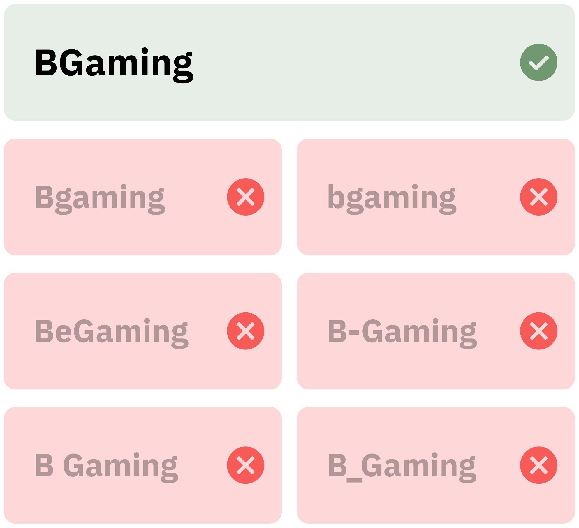
The brand name should be written in the text the only way, which is the following: BGaming. The two first letters of the brand’s name should always be capitalized. All-capitalized BGAMING is acceptable only in headlines and titles.
Bgaming, bgaming, BeGaming, B-Gaming, and B Gaming are unacceptable in the texts.
3 Game Worlds
BGaming’s portfolio structure responds to a fast-evolving iGaming market. As player behavior, formats and channels shift, we’ve defined three core patterns of motivation and engagement that shape our game collection:
BGaming’s 3 game worlds go beyond classification — they define how our portfolio is structured and expressed across product, design, and communication.

LOGO USAGE
ON BRAND COLORS
For usage on the brand’s gray, blue, or yellow color background, there is a one-color black version of the logo. This logo version is also used for embossing and other monochrome usage.
Only white version of the logo can be used on the brand’s purple color – otherwise it can affect the visibility of the logo.
ON BLACK
For usage on black and very dark color backgrounds, there is a special color version of the logo.
The main logo version on a black background uses inversion, with white-colored letters for ‘GAMING.’ The yellow plate with black letter and vertical lines remain unchanged.






LOGO USAGE
ON BRAND COLORS
The same principle applies to the logo version with the slogan. On a gray, blue, or yellow background, the one-color black version is used. On a purple – the one-color white.
ON BLACK
The logo version with the slogan on a black background uses inversion, with white-colored letters for ‘GAMING’ and the slogan line BEYOND GAME PROVIDER.






Symbol
The main brand icon of BGaming is the letter B on the yellow plate. Inverted version of the symbol is yellow letter B on the black plate.
Use the symbol in the situations where the brand is already recognizable as an alternative for the main logo version.
logo usage on art
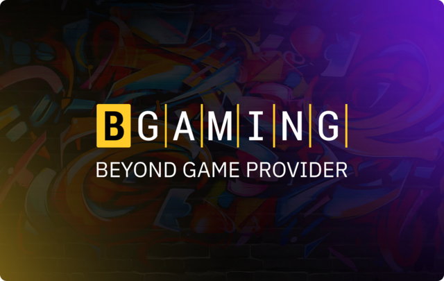
Main colour version of the logo can be used on art/photo provided the background is not too busy and has enough contrast to the logo.
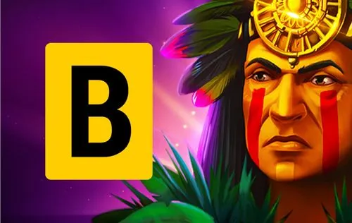
Symbol is preferable for using in game interfaces with colourful backgrounds.


logo misuse
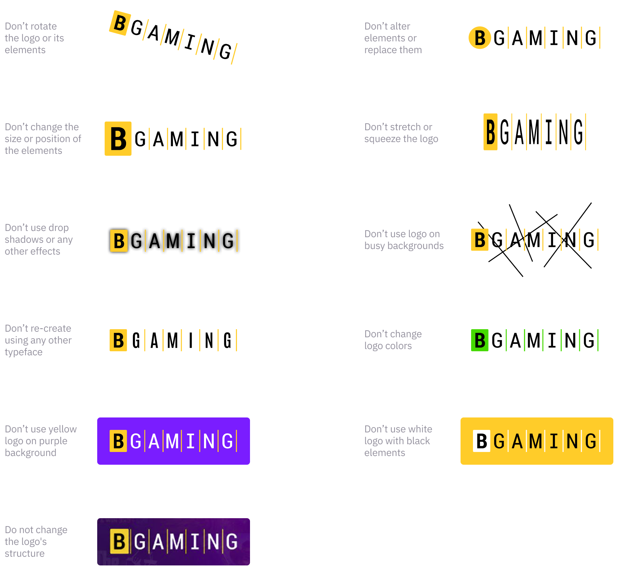
Most common examples of logo misuse can be found on this page. Please note that the logo must always be used without deformation.
Always use the logo files provided. Do not re-create.
BRAND PALETTE
Main colour of the brand is Golden Yellow. It conveys the company’s entertaining and engaging nature. Its brightness is full of energy and brings emotion, as a sparkle of a coin. White and Black communicate trustworthiness and reliability and play well with Golden Yellow.